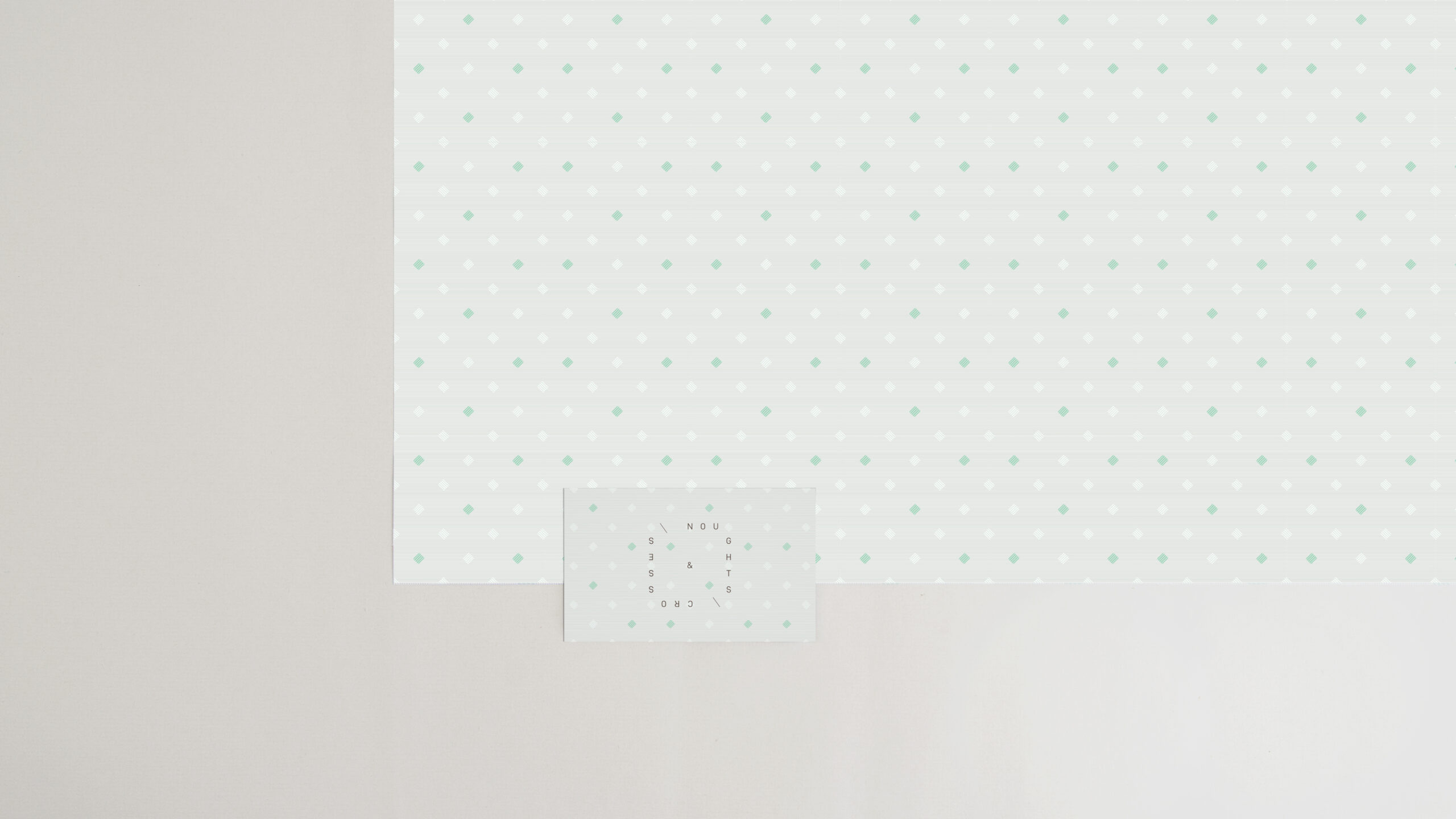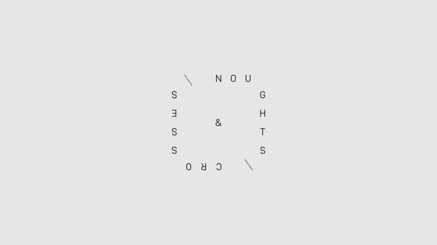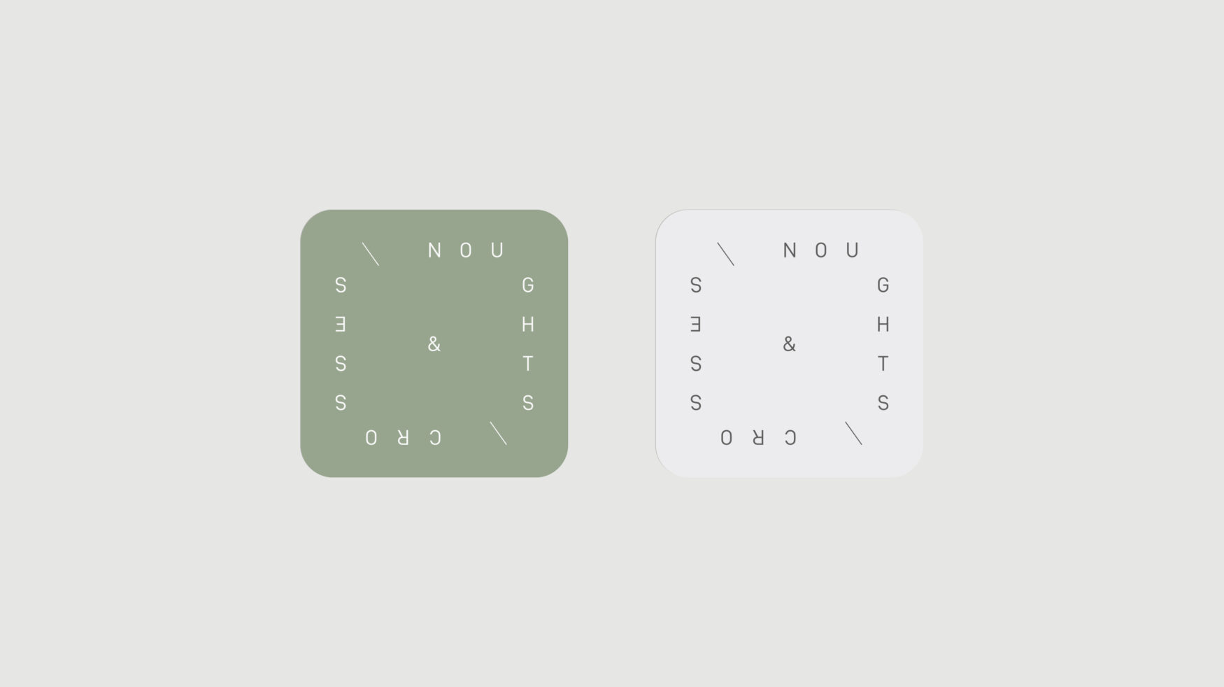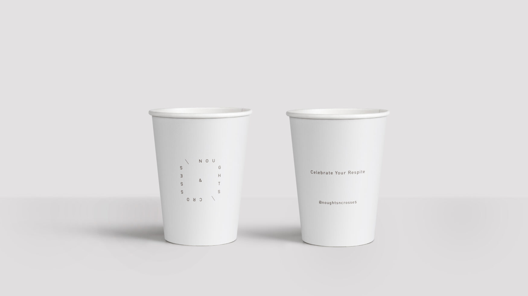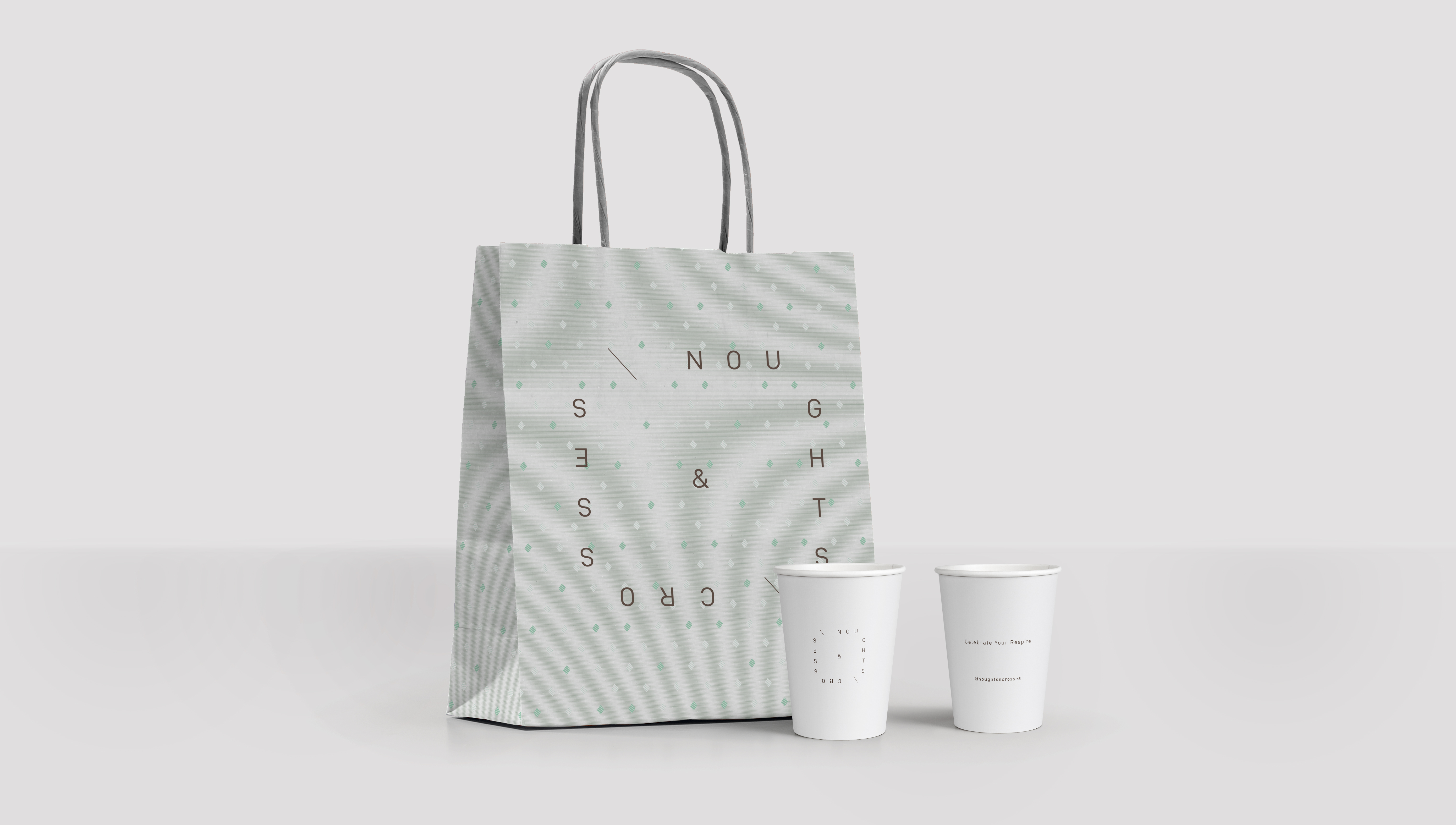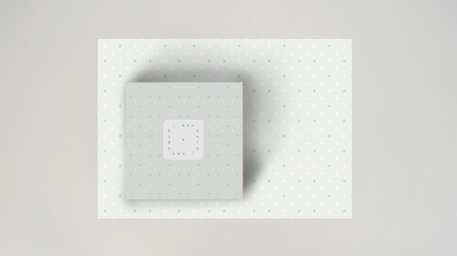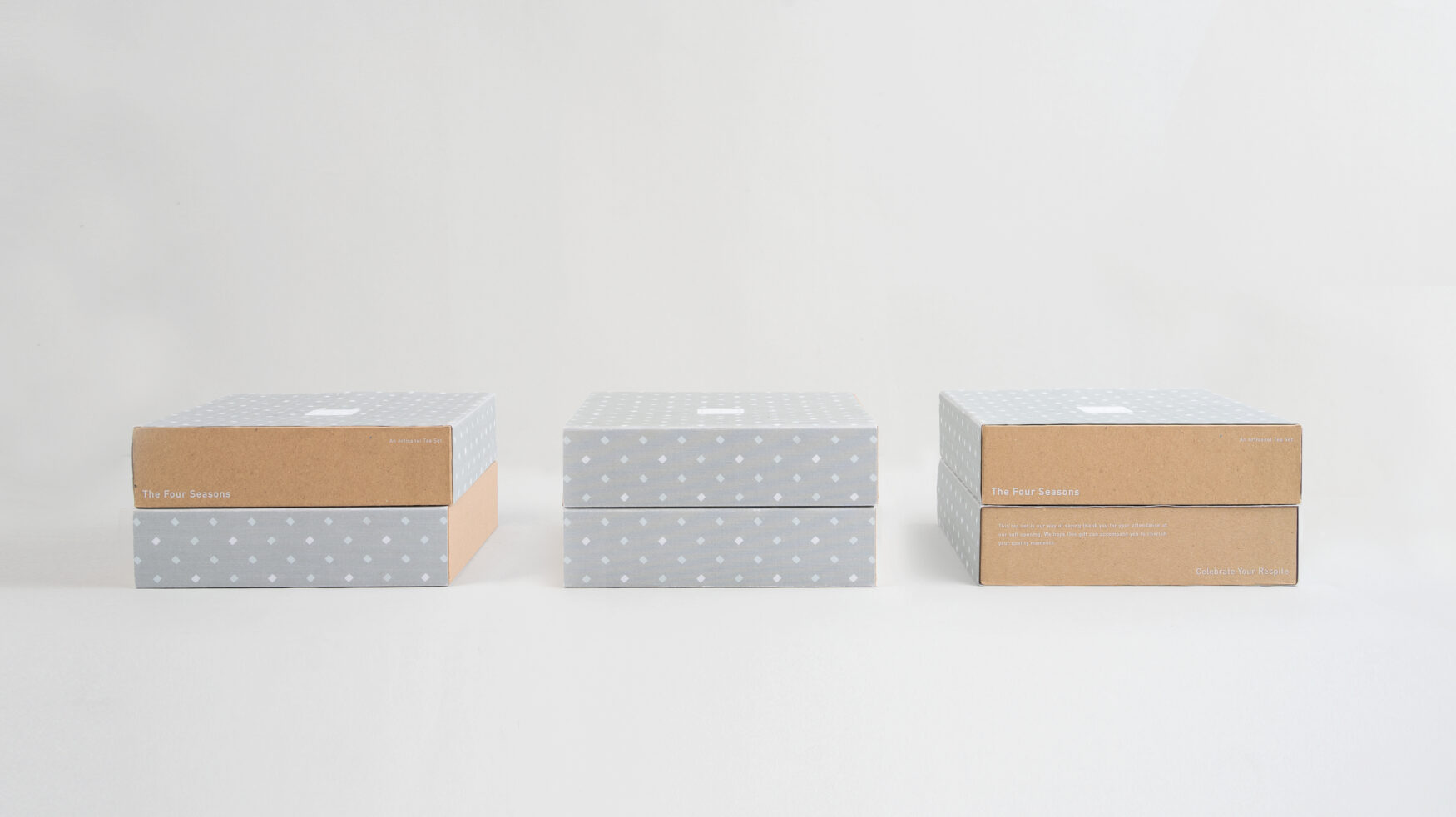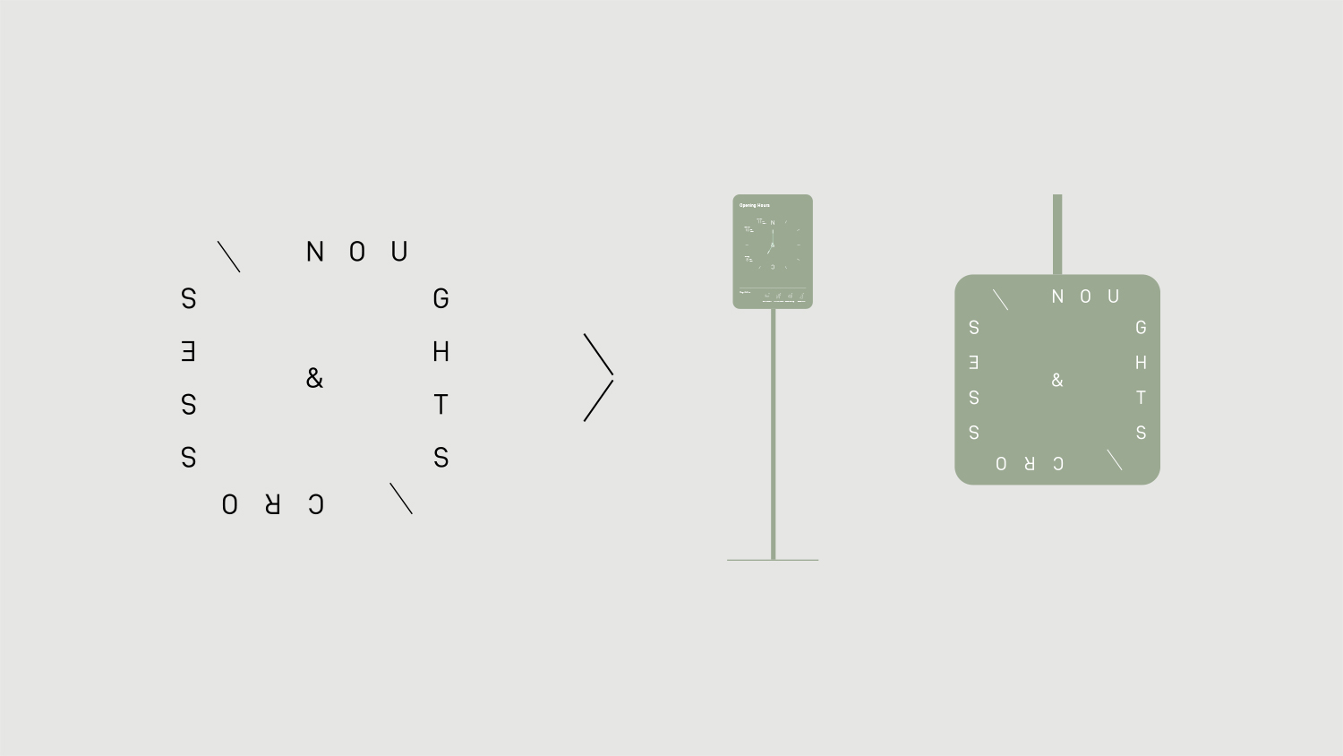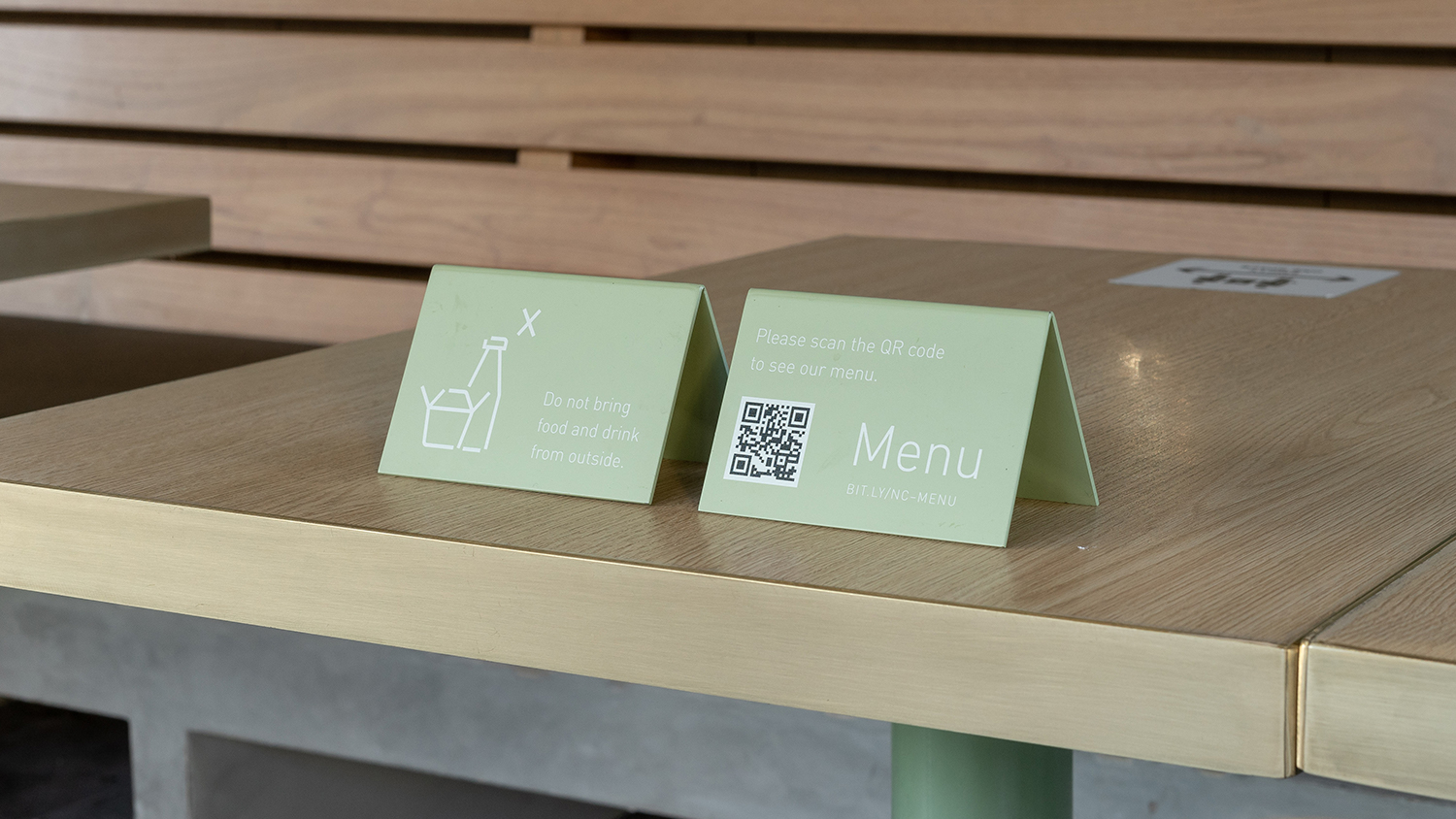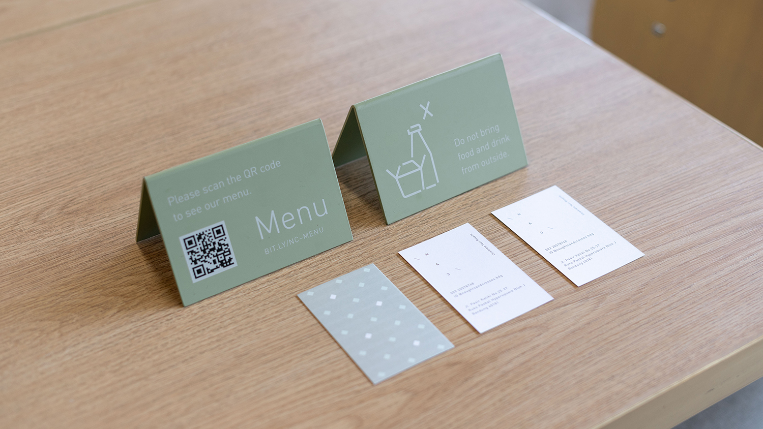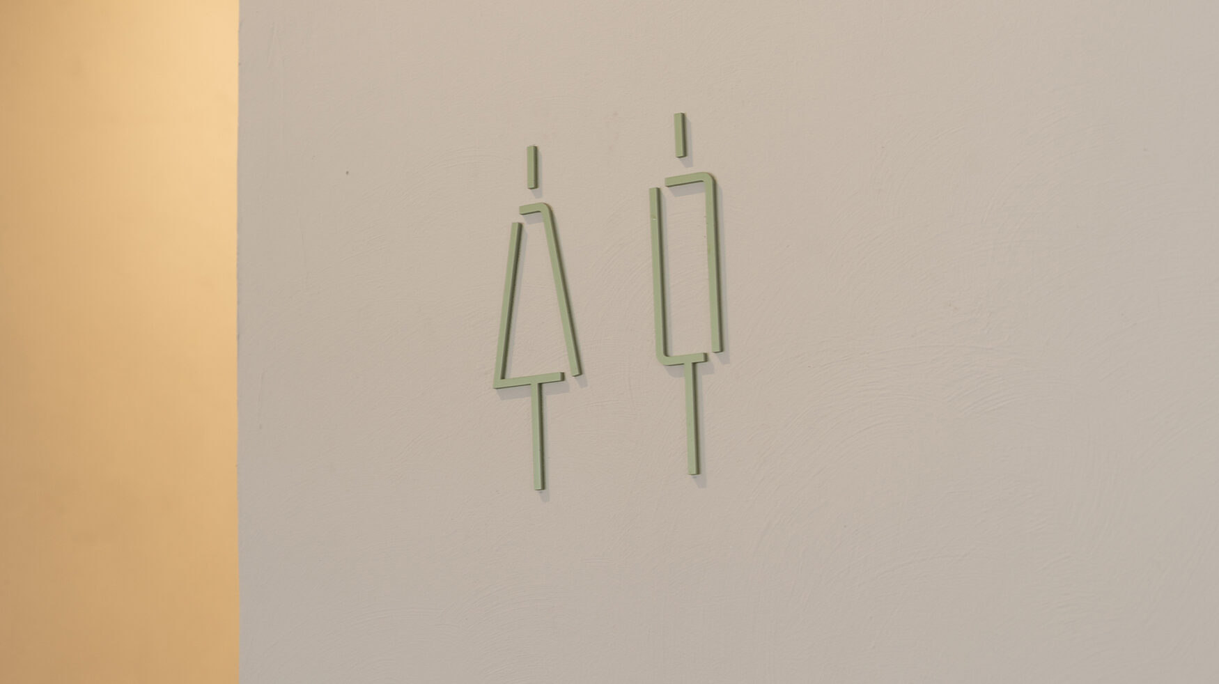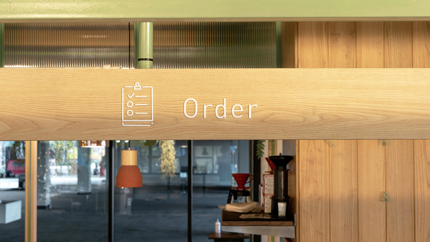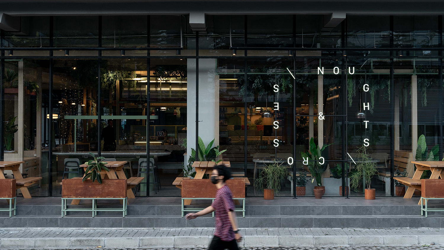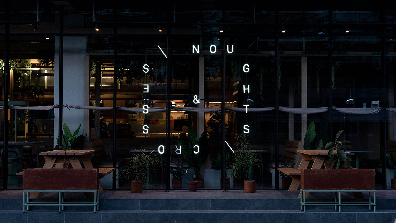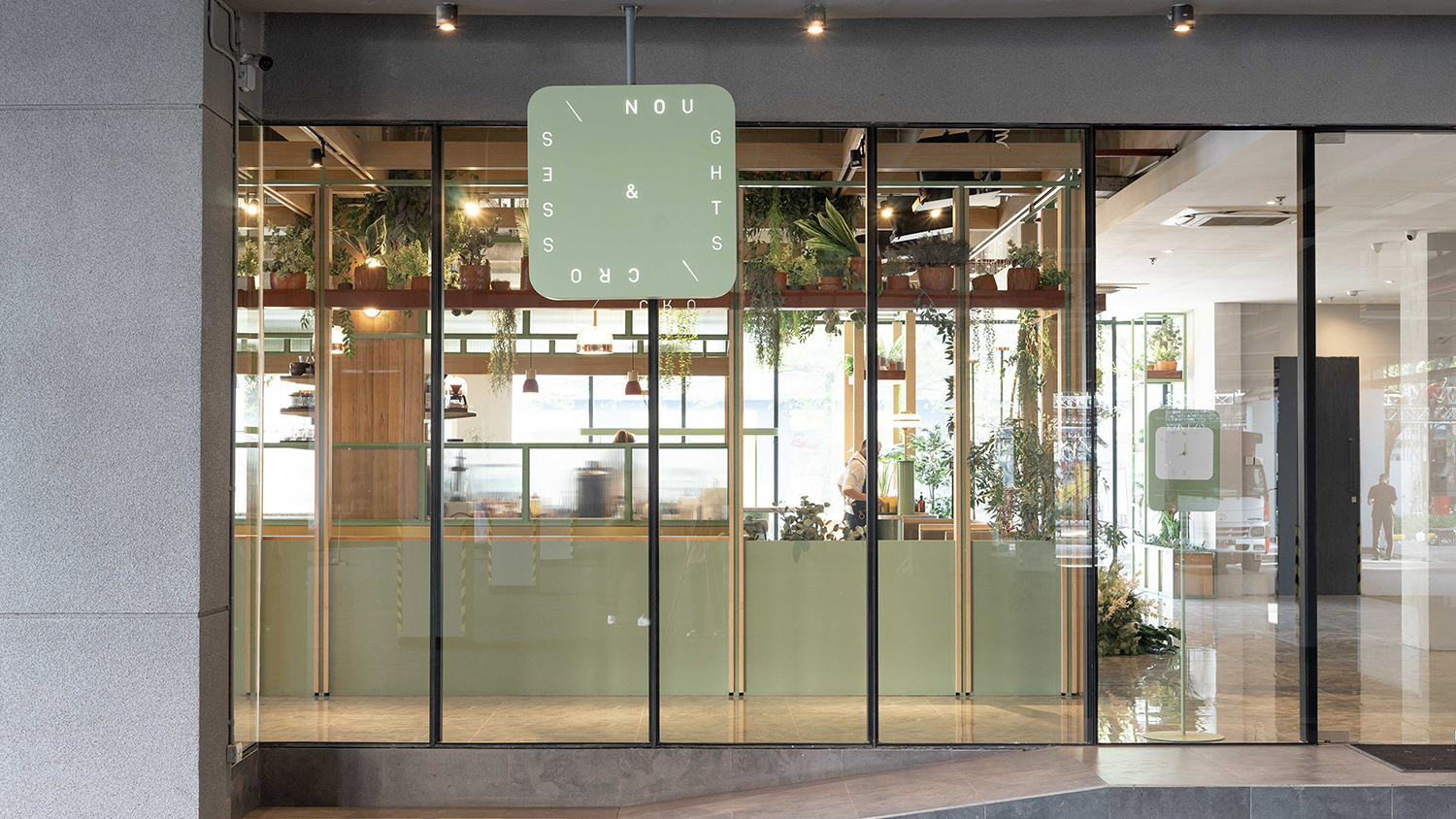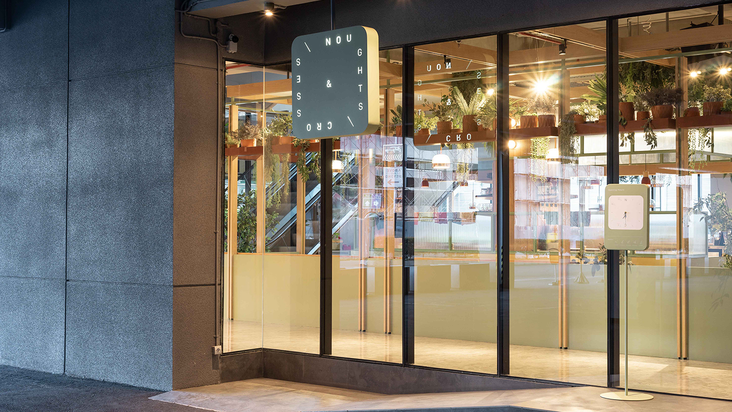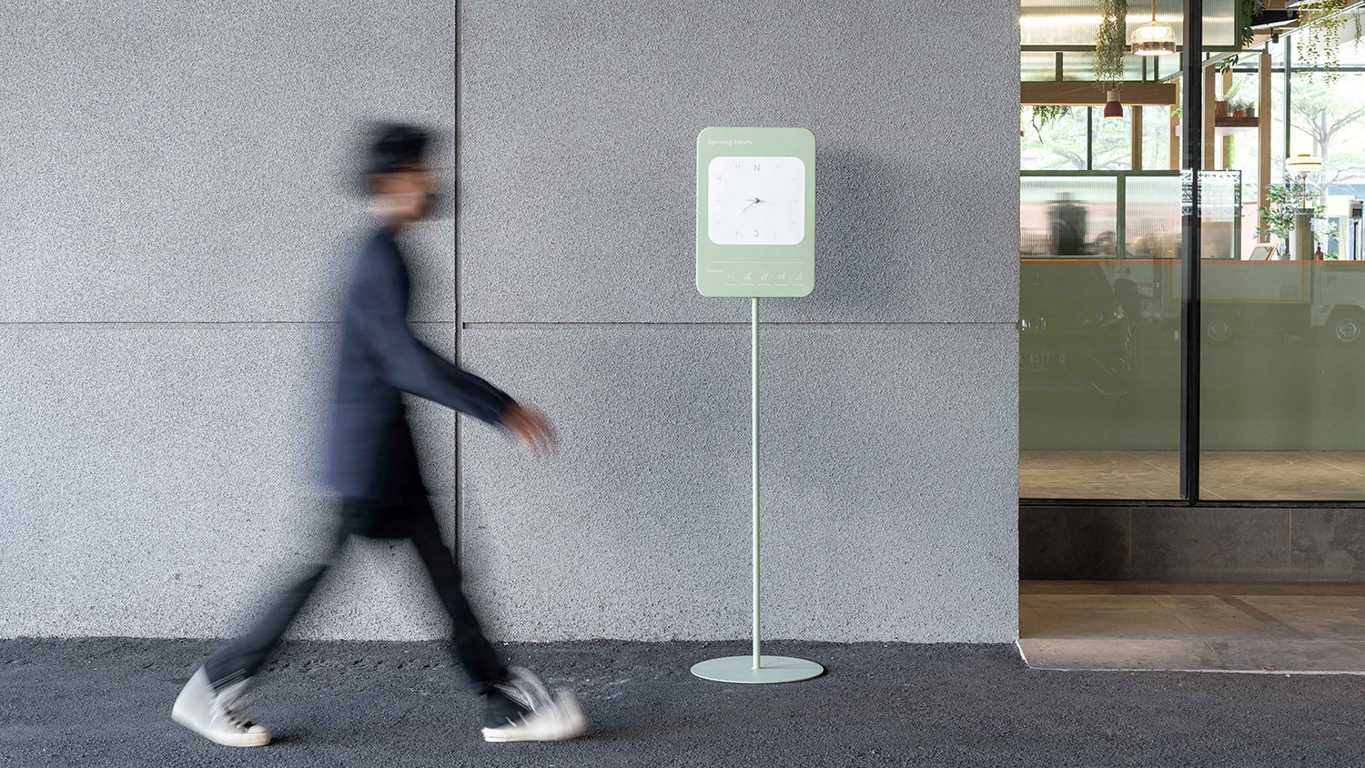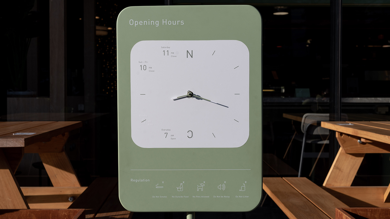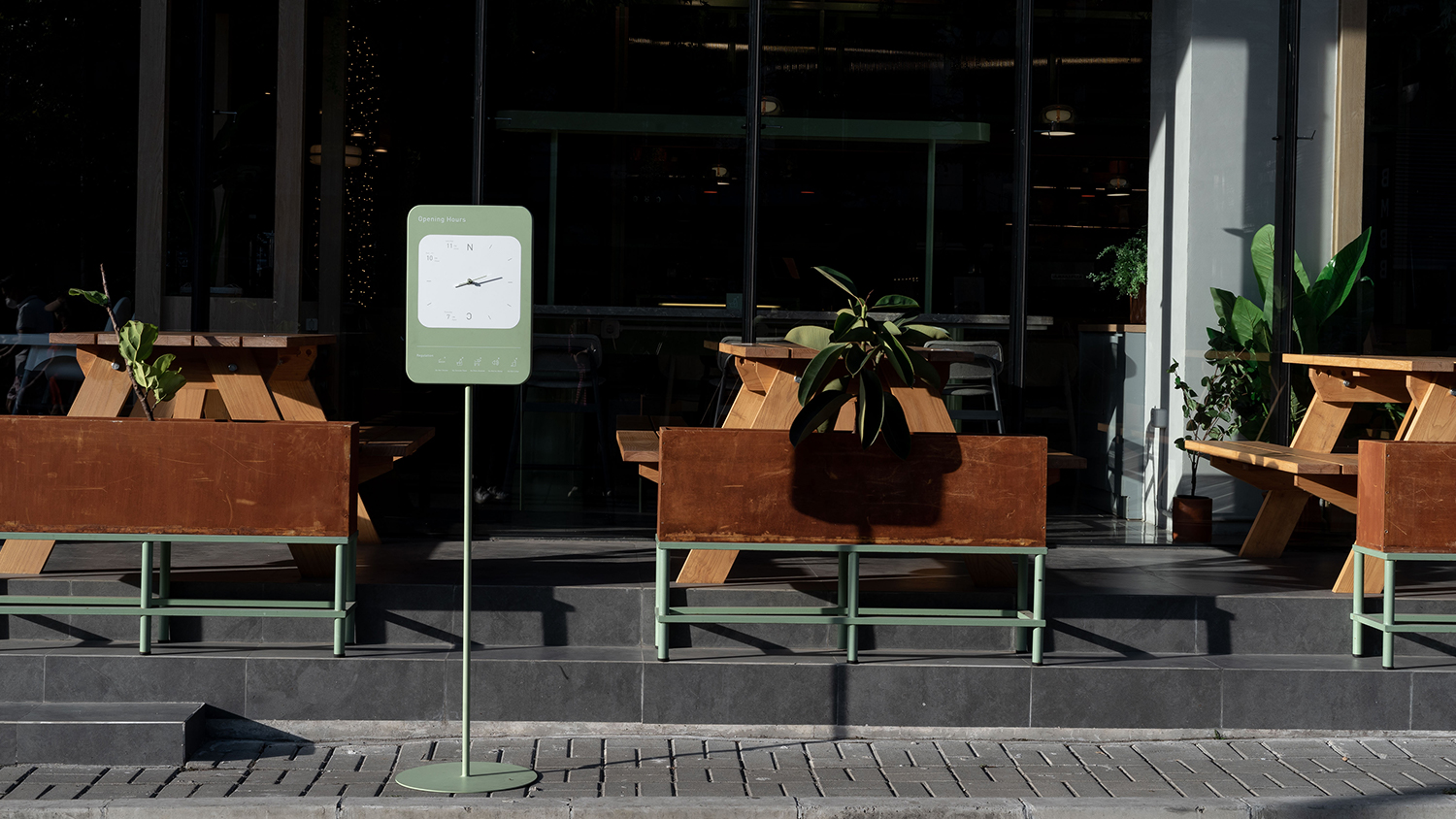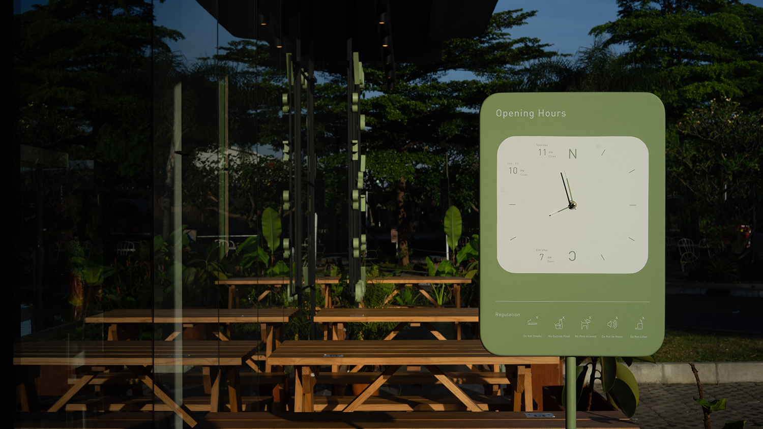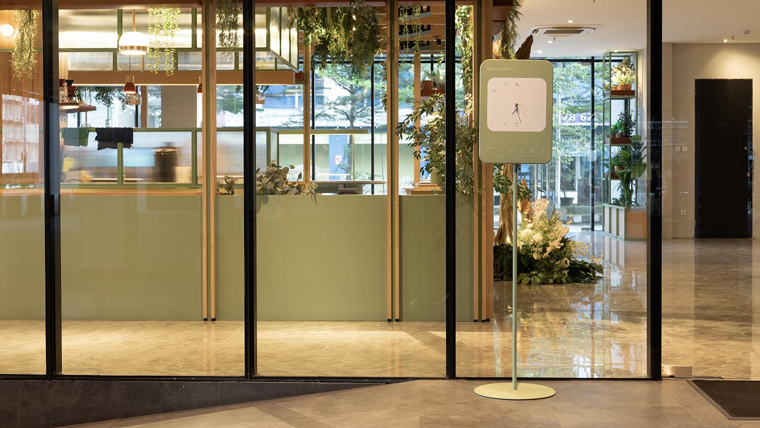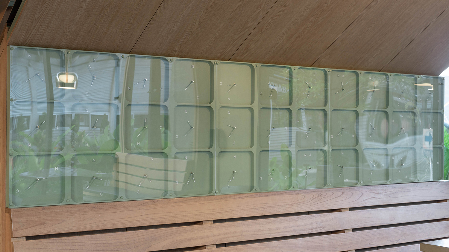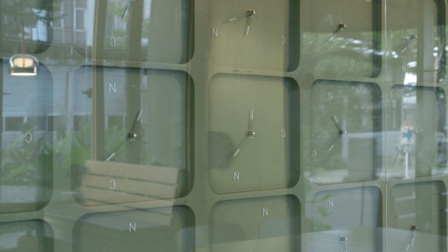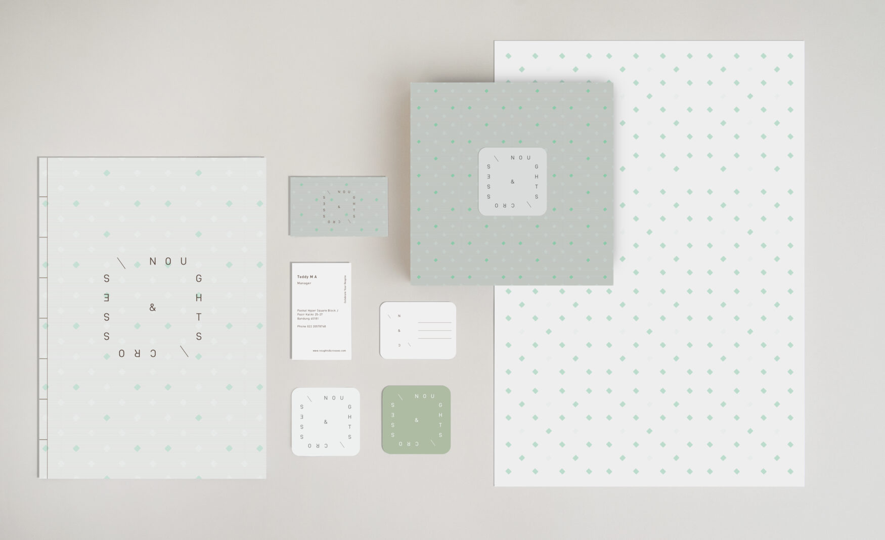
Noughts & Crosses aims to give a unique, luxurious, and comfortable hangout experience. The name itself is a synonim of the game Tic Tac Toe, a game that is commonly played in spare time. While we were brewing the design concept, we kept the word “spare time” in mind. From the concept of time, we developed its visual identity concept and tried to manifest it in many environmental graphic design mediums such as graphic ambient, signages, pictograms, etc. The soft pastel color selection combined with modern minimal design gives Noughts & Crosses a unique, chic look.
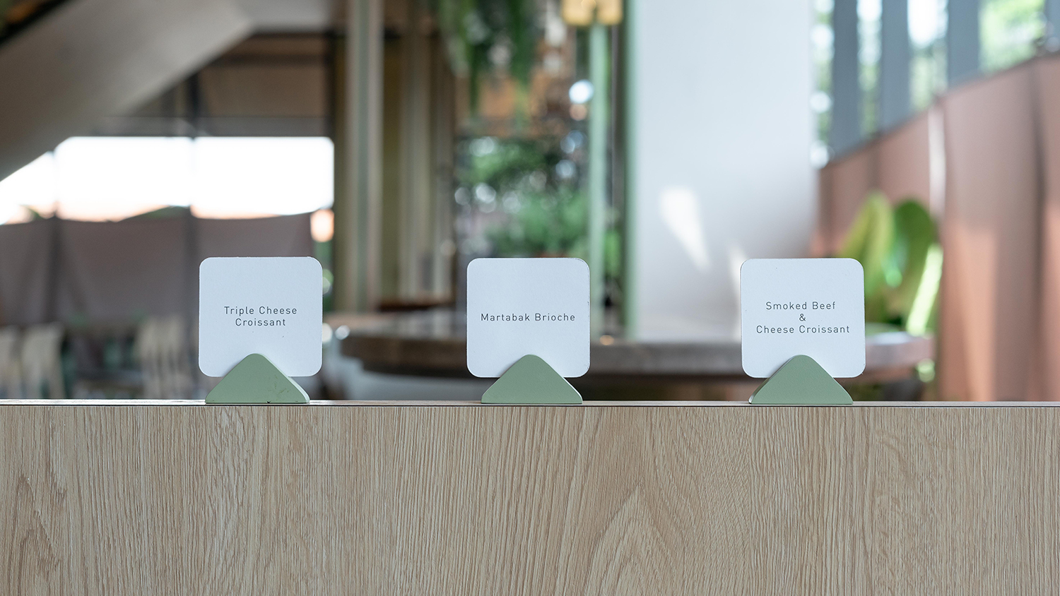
The overall impression of Noughts & Crosses visual identity design is one of playfulness, without being overwhelming, and it projects a pop sensibility in terms of branding by utilizing catchy pastel colors for the service items, interiors, and social media template. From the clock-like logo to various implementations of it in the wall decoration and the free-standing clock + signage, all are important aspects to compose one solid brand identity and comfortable hangout space with uniquely designed environmental graphic design.
