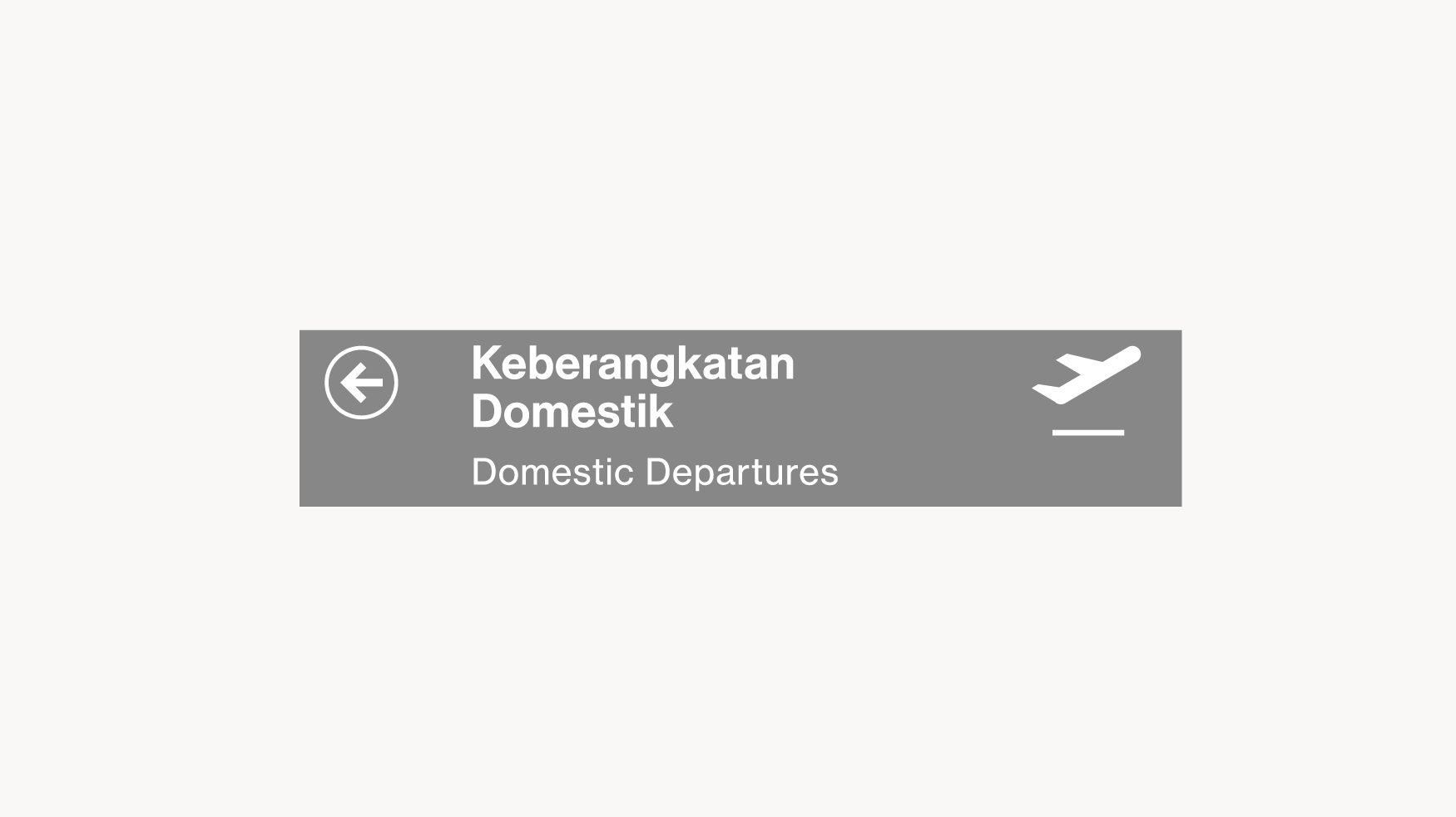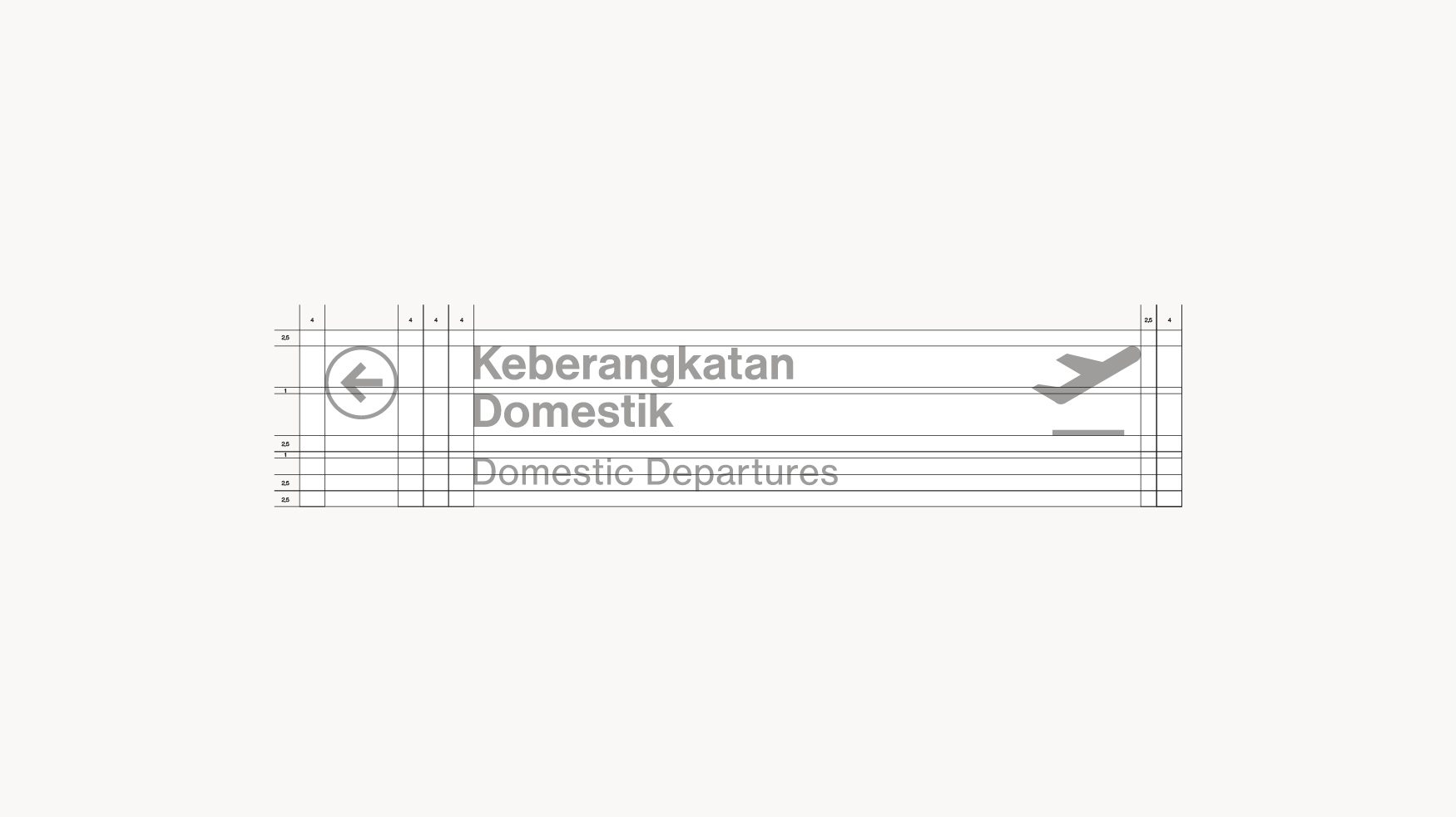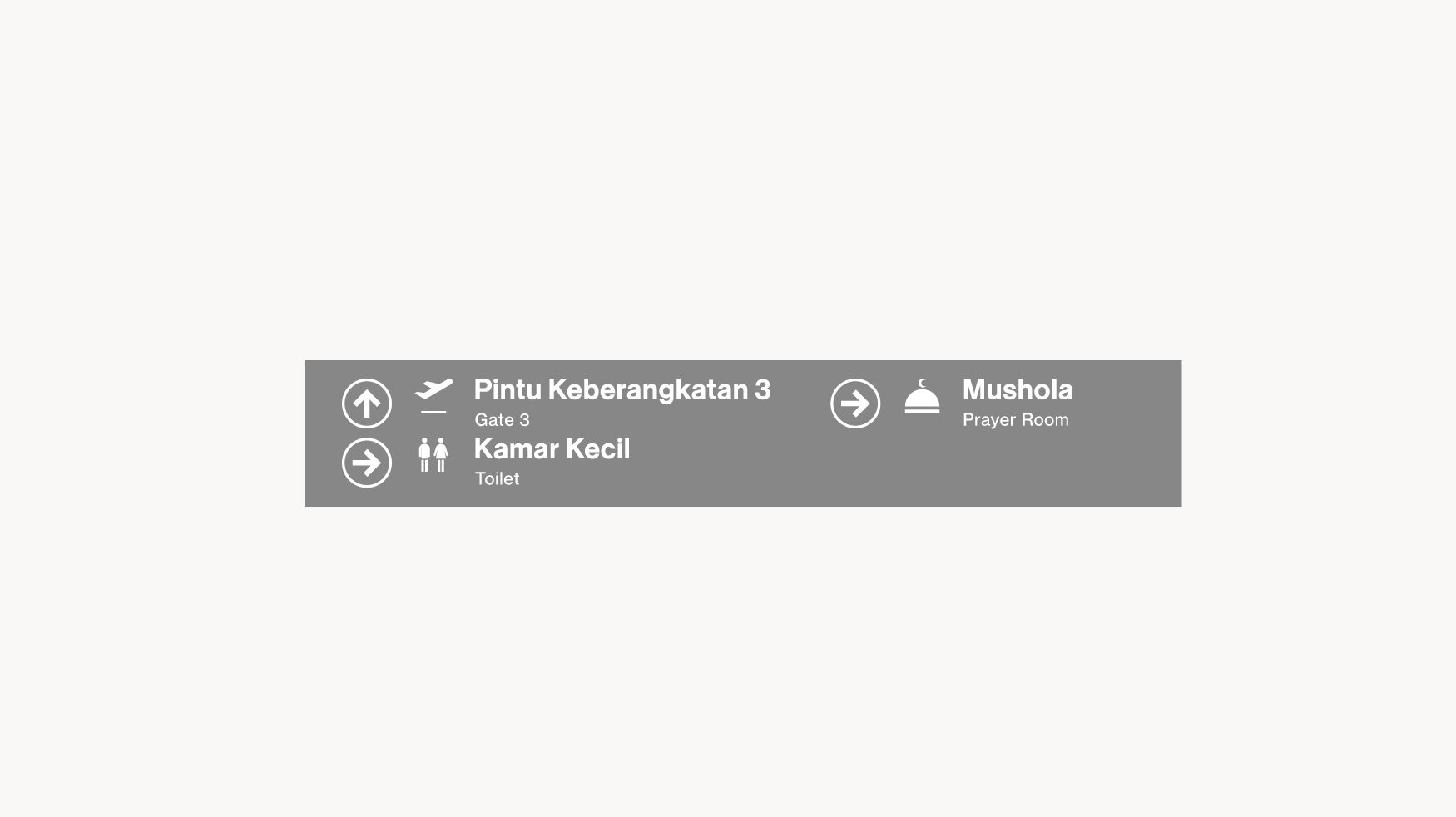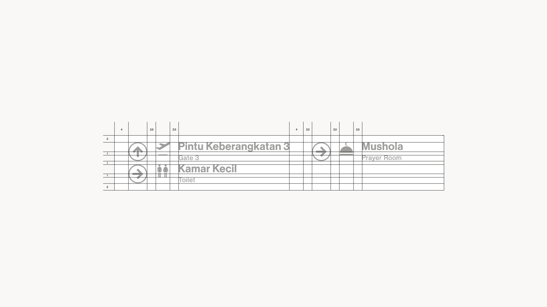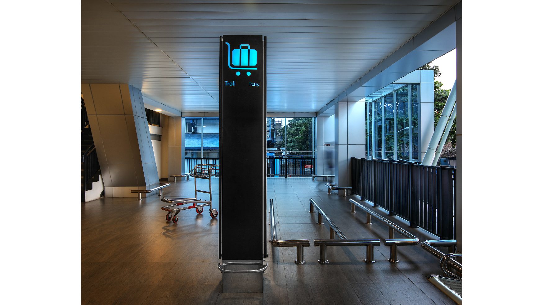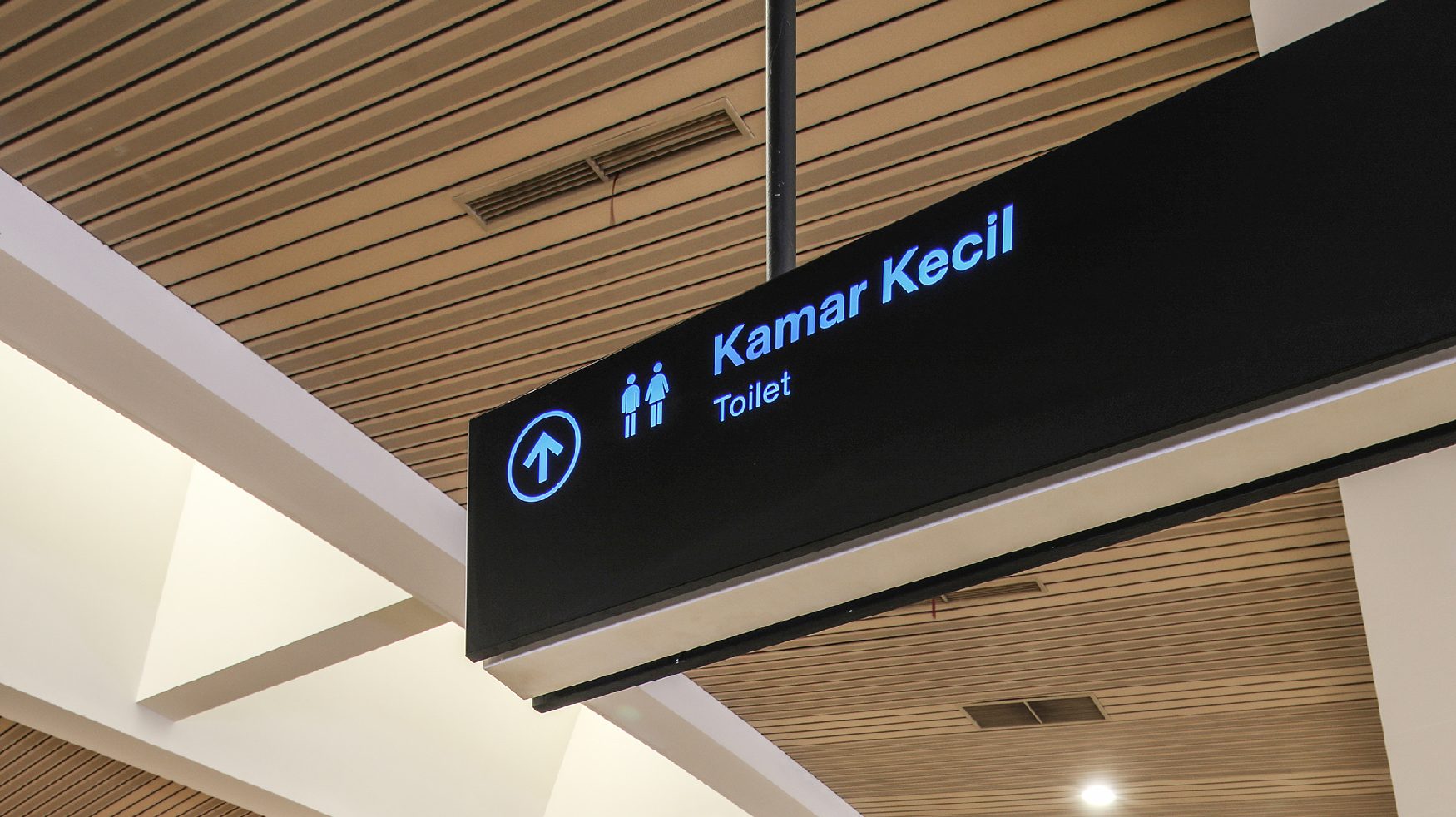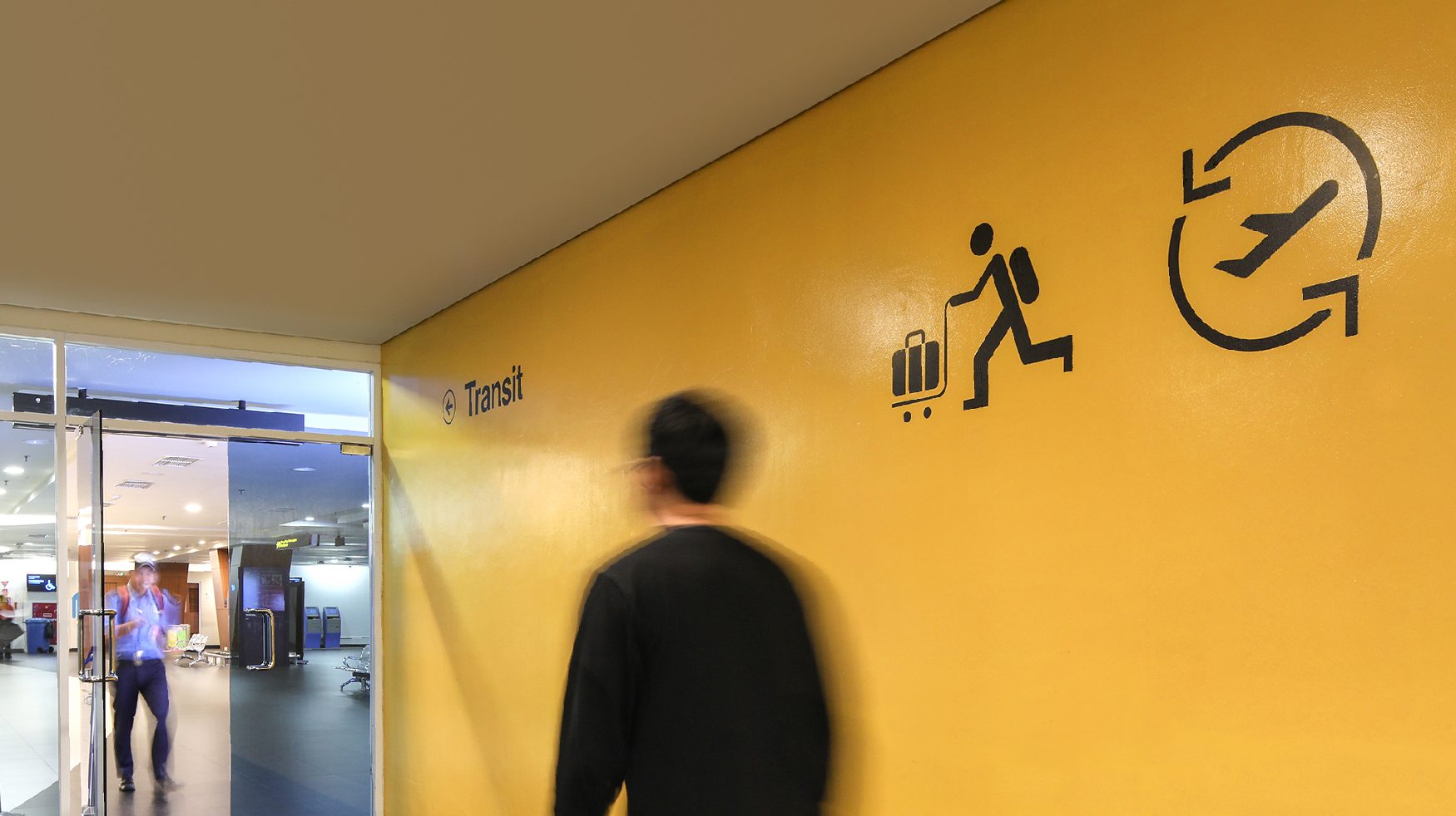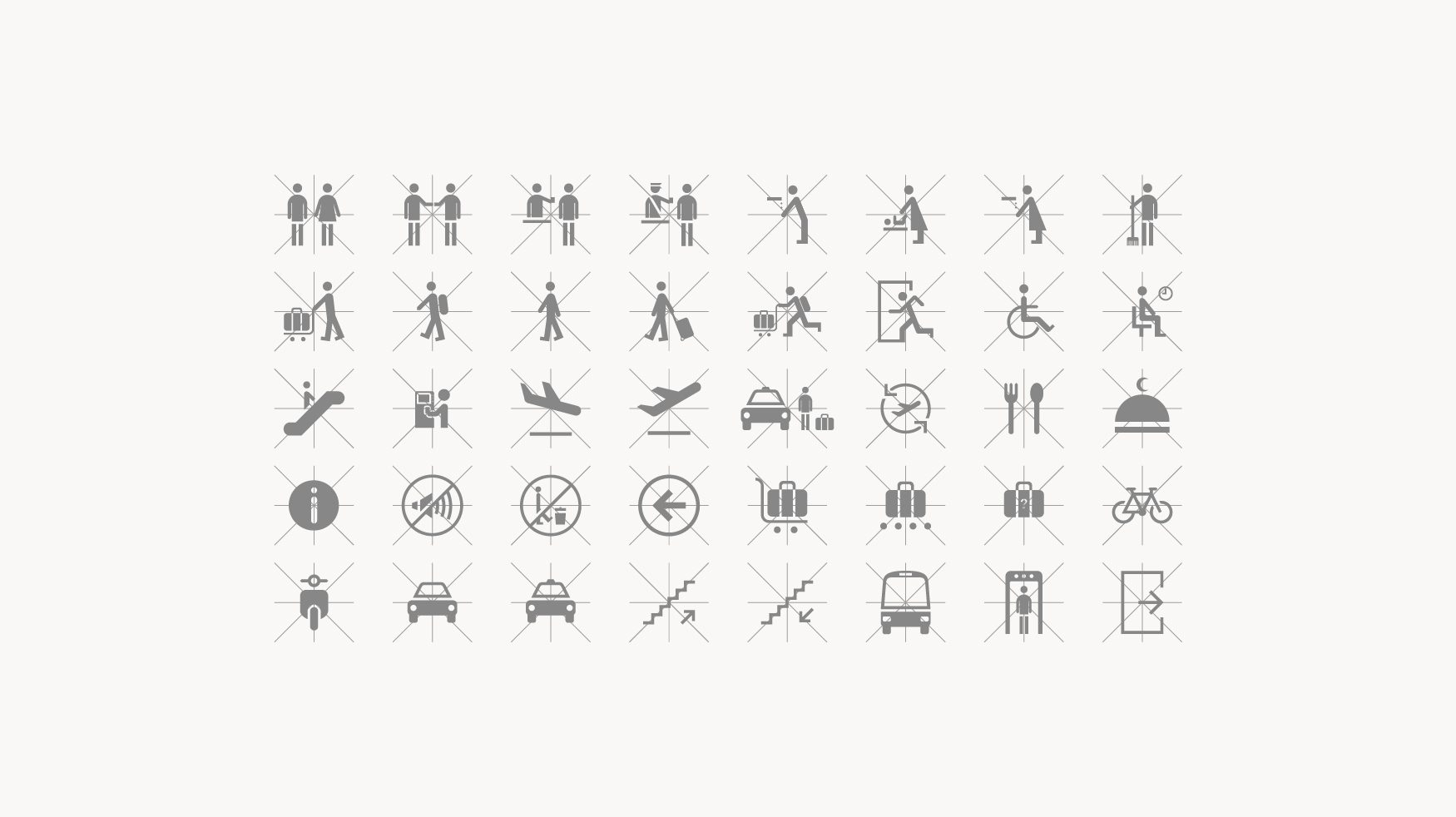
The orientation system in Husein Sastranegara guides people through the newly designed airport in Bandung, which combines listed buildings with modern architecture and interior design. The wayfinding and information system is designed based on a strong concept; it is functional and supports a unified visual identity, taking into account the existing guidelines of airport signage by Direktorat Jenderal Perhubungan Udara. We chose Neue Haas Grotesk as the default typography because it has a rigid structure but still visually pleasing. Colors are based on standardized guideline and as for pictogram we modified it using grid system to ensure its legibility.
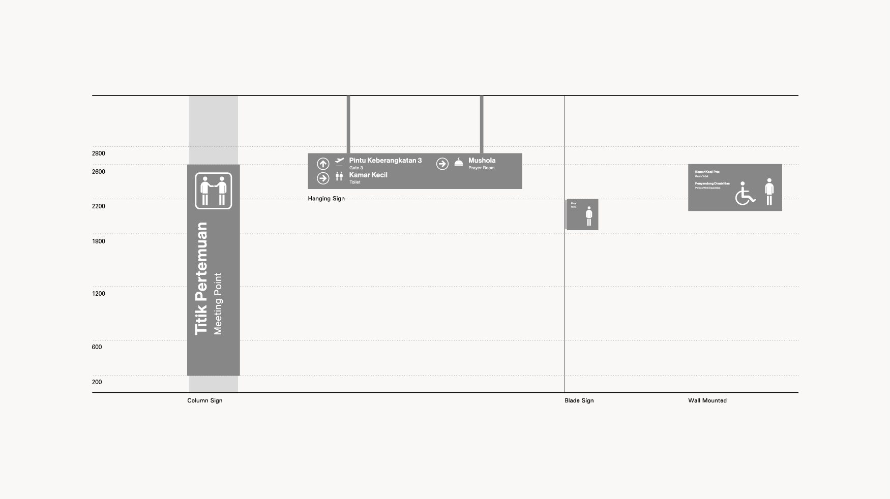
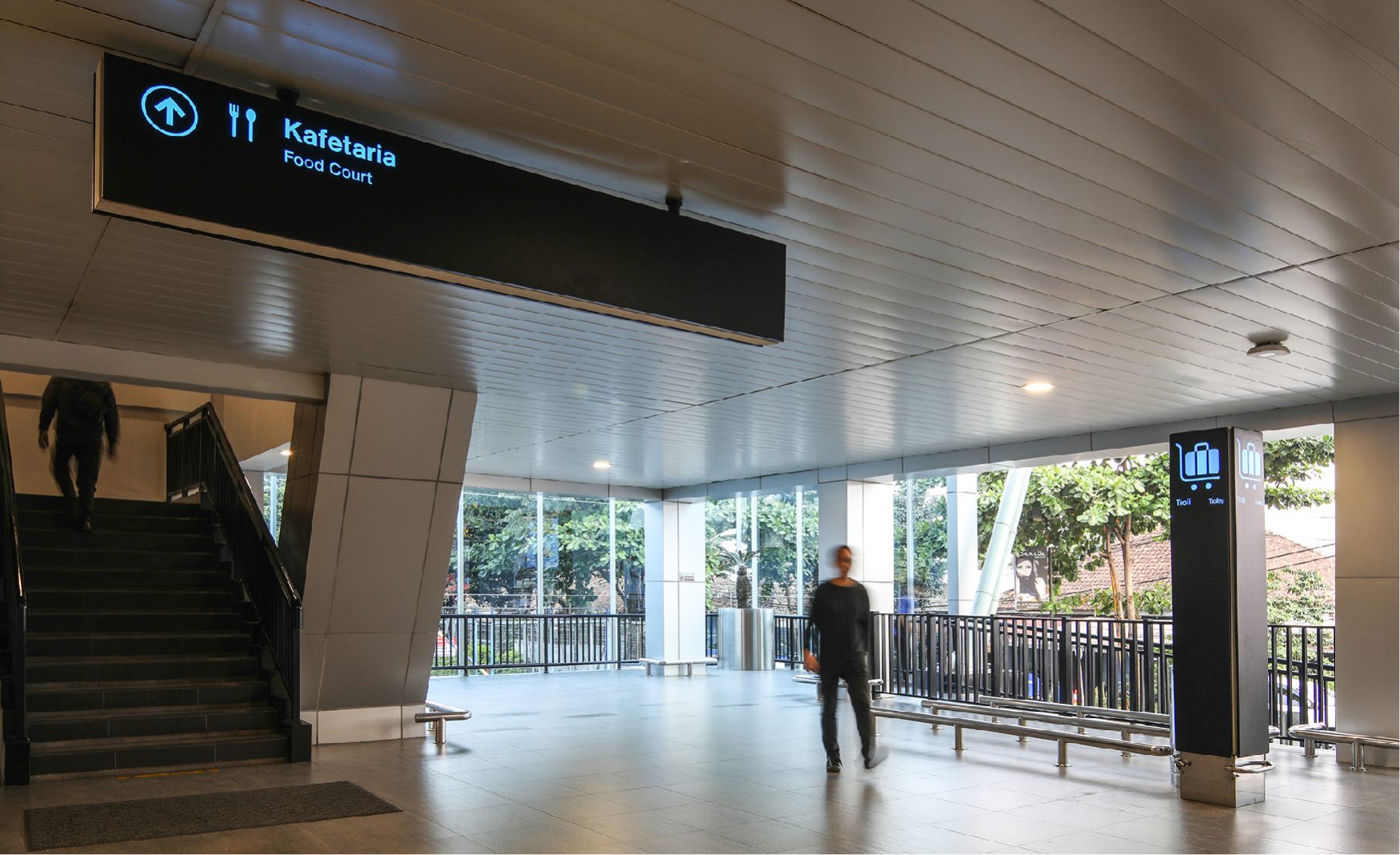
Visual composition and proportions of our signage, designed t be seen optimally for its intended users’ line of vision and movement flow.
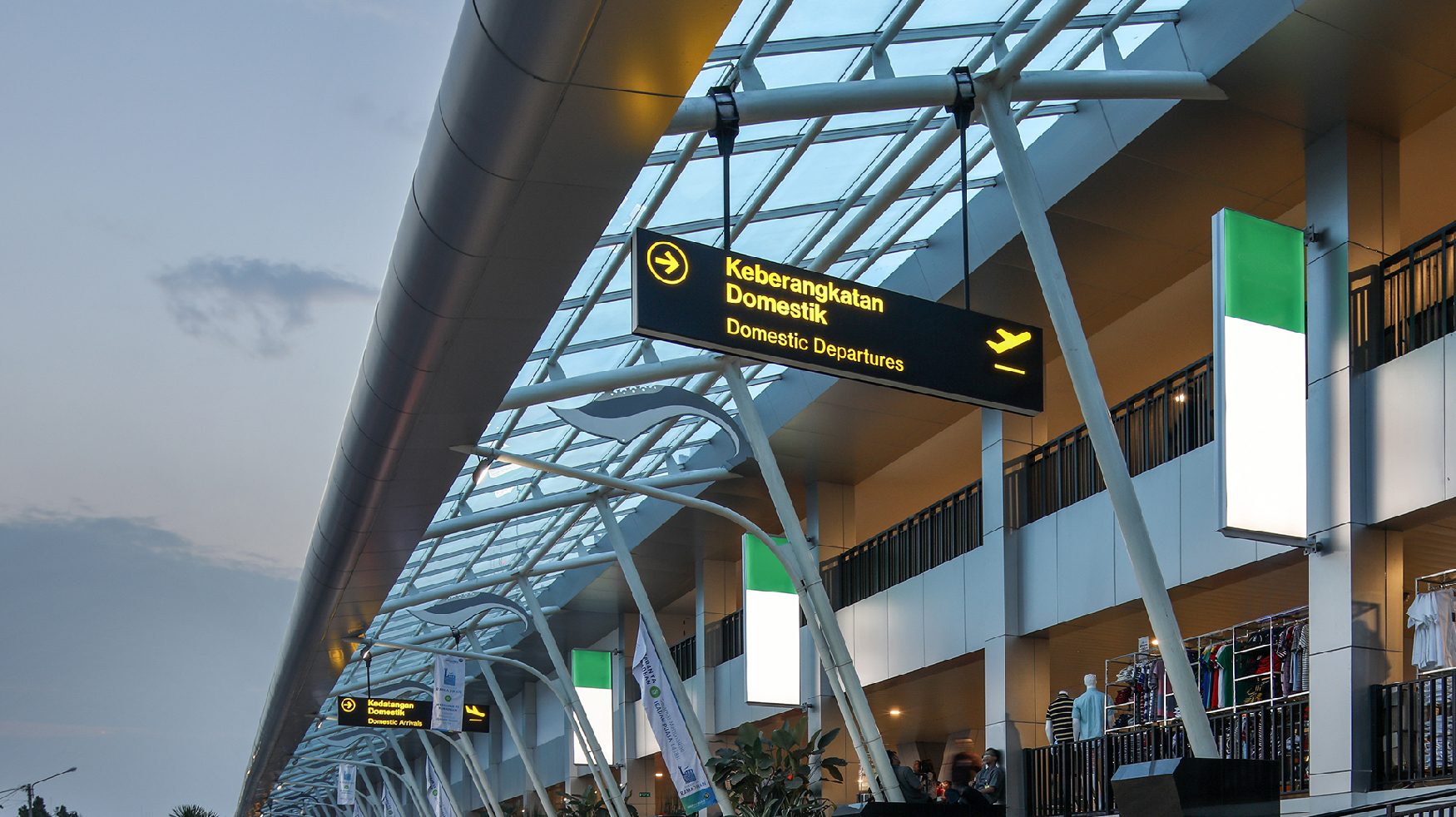
Signage for the outdoor area of Husein Sastranegara International Airport.
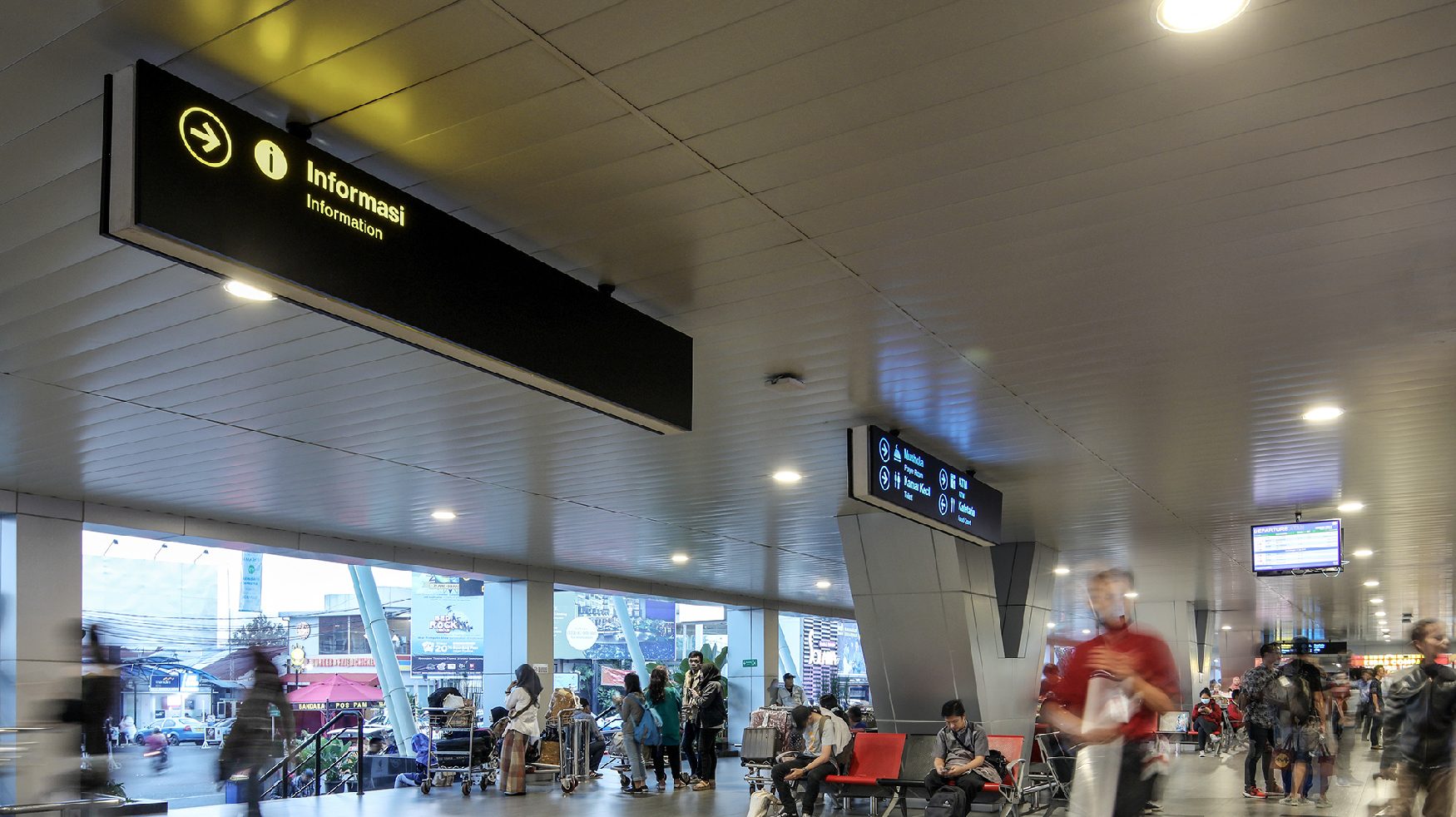
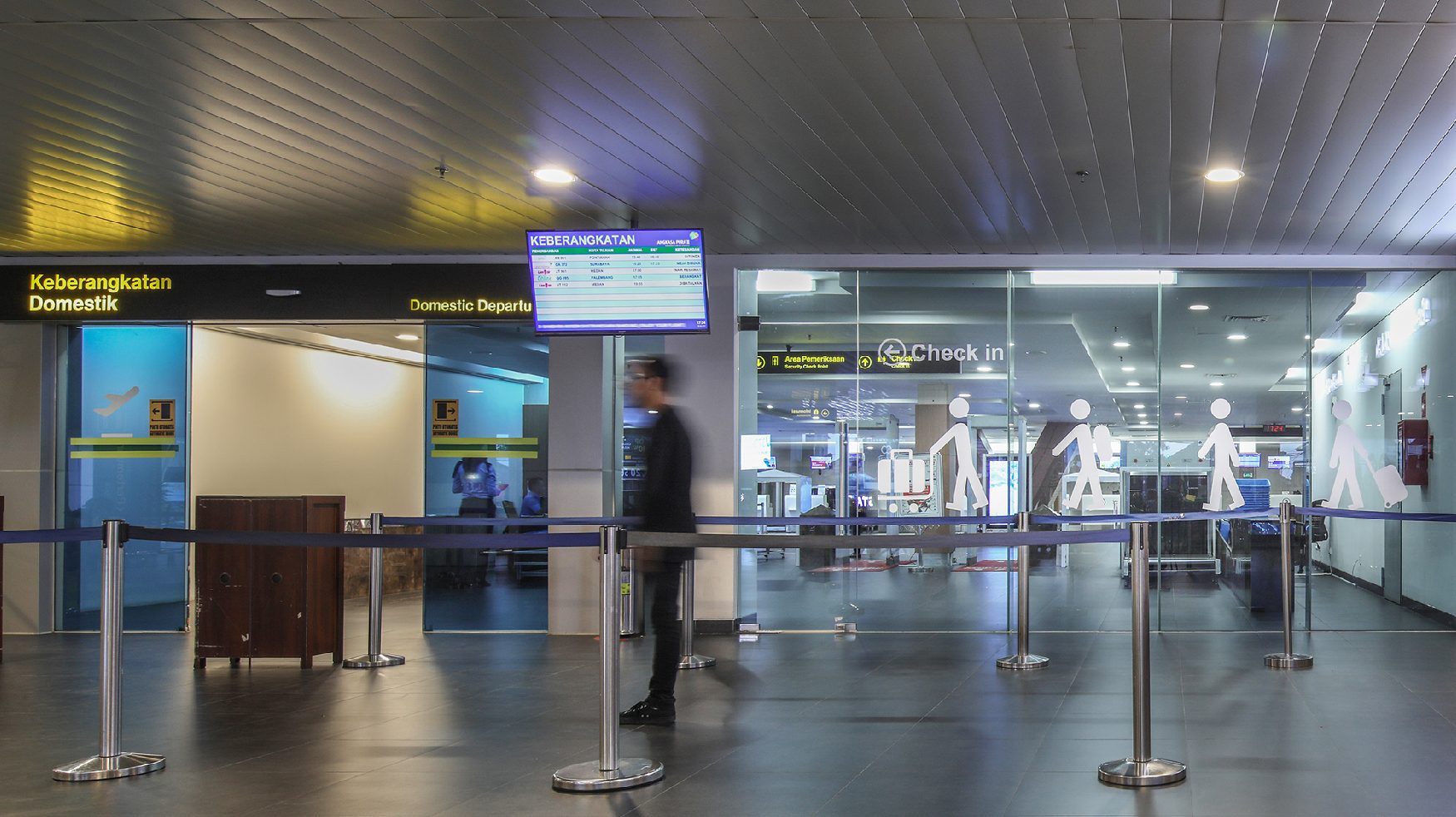
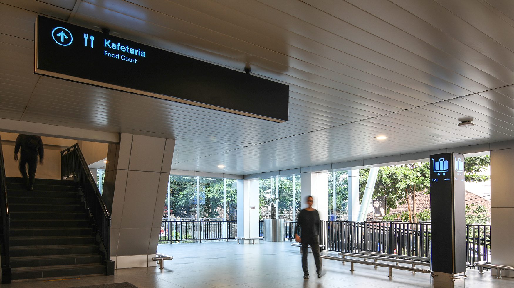
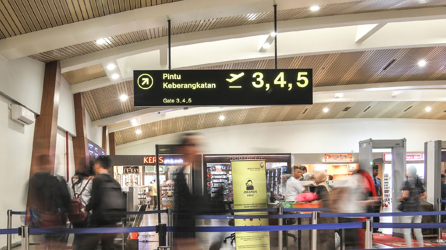
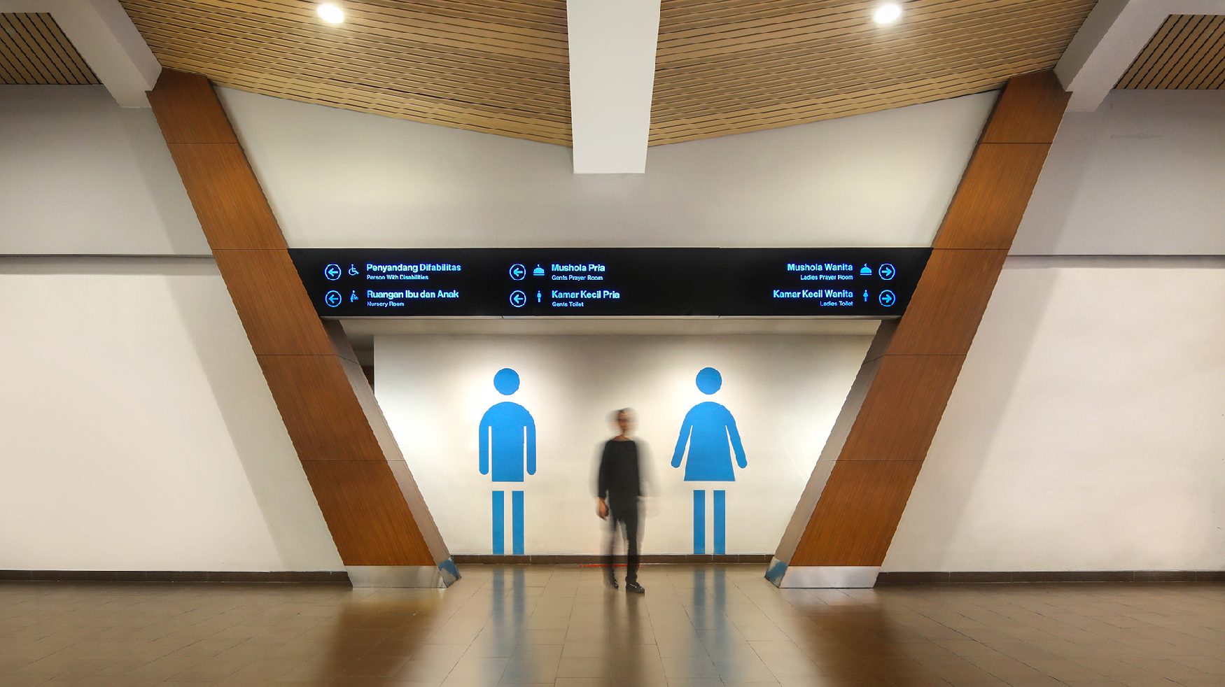
Signage for the indoor area of Husein Sastranegara International Airport.
Husein Sastranegara International Airport’s pictogram is designed to be as easily interpreted as possible, with appropriate proportions and placing composition. Our aim is to create clear information for airport users who are possibly from another country (unfamiliar with the written language) or in a hurry.
